
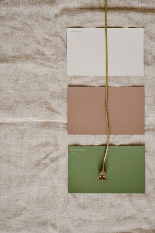
A calm colour scheme can make your home feel more comfortable, welcoming, and easy to live in. Soft shades often create a sense of order and relaxation, while carefully chosen accents add personality without making a room feel busy.
Choosing calming colours does not mean every wall has to be white or beige. Muted blues, gentle greens, warm neutrals, soft greys, and subtle earth tones can all create a peaceful atmosphere. The key is to consider how colours work together and how they respond to the light in your home.
Start with the feeling you want to create
Before choosing a paint colour, think about how you want the room to feel. A bedroom may benefit from quiet, restful shades, while a living room might need a little more warmth and energy without becoming overwhelming.
Consider words that describe the mood you want:
– Relaxed
– Airy
– Cosy
– Fresh
– Balanced
– Warm
– Natural
– Simple
These words can help guide your choices. For example, soft blue and pale grey may suit an airy, restful room, while warm beige and muted green may create a cosy, natural feeling.
It is also helpful to consider how you use the room. A space for reading or relaxing may work well with deeper, muted colours. A small entrance or hallway may feel brighter with a light, warm neutral.
Explore calming colour families
Different colour families create different impressions. Understanding their general effect can make it easier to narrow down your options.
Soft blues
Blue is often associated with open skies and quiet water. Light blue, dusty blue, and blue-grey can make a room feel peaceful and spacious. These colours work especially well in bedrooms, bathrooms, and areas with plenty of natural light.
If a blue feels too cool, look for a shade with a grey or green undertone. Pairing it with warm wood, woven materials, or cream-coloured fabrics can also make the room feel more inviting.
Gentle greens
Muted green shades bring a natural quality indoors. Sage, eucalyptus, olive, and soft moss can create a relaxed look without feeling plain. Green is a flexible choice for living rooms, offices, kitchens, and bedrooms.
For a lighter appearance, choose a pale sage or grey-green. For a richer, more grounded look, consider a muted olive or forest-inspired shade. Keep the colour soft and slightly subdued if you want to maintain a calm atmosphere.
Warm neutrals
Warm neutrals include cream, sand, beige, taupe, and greige. These shades provide a versatile background and can make a room feel comfortable and settled. They are useful when you want flexibility with furniture, artwork, and accessories.
Warm neutrals are often a good choice for open-plan homes because they can connect several areas without creating visual clutter. Choose a shade with enough depth to avoid a flat appearance, particularly in rooms with strong sunlight.
Soft greys
Grey can be calm and modern, but some shades may feel cold or stark. Look for soft grey with warm undertones if you want a more welcoming result. Grey-beige blends, sometimes called greige, can offer the clean look of grey with the warmth of beige.
Soft greys work well with white trim, natural wood, black accents, and muted colours. They can also provide a quiet backdrop for colourful artwork or patterned textiles.
Think about natural and artificial light
Lighting has a major effect on how a colour appears. The same paint can look different in the morning, afternoon, and evening.
North-facing rooms often receive cooler, softer light. Warm neutrals, gentle greens, and shades with yellow or beige undertones can help balance this effect. South-facing rooms usually receive more direct light, so cooler colours may feel comfortable and balanced.
East-facing rooms can look bright in the morning and softer later in the day. West-facing rooms often have gentler morning light and warmer afternoon light. If a room has limited windows, a light colour with a warm undertone may help it feel more welcoming.
Artificial lighting matters, too. Warm bulbs can make beige, cream, and brown tones look richer. Cooler bulbs may make blue and grey appear more noticeable. Test your colour choices under the lighting you use most often.
Use the colour wheel as a simple guide
You do not need to be a design expert to use a colour wheel. It can help you understand which colours tend to work well together.
For a peaceful combination, try:
– Similar colours, such as blue, blue-green, and soft green
– One main colour with different shades of the same colour
– A neutral base with one muted accent colour
– Warm and cool colours in balanced amounts
A simple approach is the 60-30-10 rule. Use one main colour for about 60 percent of the room, a supporting colour for about 30 percent, and an accent colour for the remaining 10 percent. The proportions do not need to be exact. They simply help prevent the room from feeling too busy or uneven.
Consider the existing features
Paint is only one part of a room’s colour scheme. Look at the flooring, furniture, curtains, countertops, tiles, and artwork before making a decision.
If your floors have warm wood tones, warm neutrals, muted greens, and soft blues may complement them well. If your furniture is mostly white or grey, adding warmer wall colours can prevent the room from feeling too cool.
Permanent features deserve particular attention. A countertop, fireplace, or large built-in unit may have undertones that are easy to overlook. Hold paint samples beside these features to see whether the colours work together.
Test paint before committing
A small colour card may not provide enough information. Whenever possible, test a larger sample on several walls.
Observe the sample at different times of day:
– In the morning
– Around midday
– In the evening
– With the lights turned on
– On both sunny and cloudy days
Paint colours can look lighter, darker, warmer, or cooler depending on their surroundings. If you do not want to paint directly on the wall, apply samples to large pieces of white card and move them around the room.
Avoid comparing a sample only against a bright white wall. The contrast can make the colour look stronger than it will appear in the finished room.
Add depth with texture
A calm colour scheme does not have to look dull. Texture adds interest while keeping the overall appearance gentle.
Try combining:
– Linen curtains
– Wool or cotton throws
– Woven baskets
– Natural wood
– Ceramic accessories
– Soft rugs
– Matte and lightly polished surfaces
Using several textures in similar colours can make a room feel layered and comfortable. For example, a pale green wall can work with a woven rug, a linen cushion, and a light wood side table without needing bold patterns.
Keep accents controlled
Accent colours can bring a room to life, but too many strong shades may interrupt the peaceful mood. Choose one or two accent colours and repeat them in small ways through cushions, artwork, books, plants, or decorative objects.
Muted terracotta, dusty rose, soft navy, ochre, and charcoal can all add depth. If you prefer a very quiet look, use natural materials and darker versions of your main colour instead of bright accents.
Create a connected colour flow
In an open-plan home, choose colours that relate to one another. You do not have to use the same shade throughout the entire space. Instead, select colours from the same family or use one neutral as a connecting element.
For example, a warm off-white in the main area could lead into a soft sage kitchen and a muted blue reading corner. Repeating wood tones, fabrics, or small accessories can make the transition feel intentional.
Final tips for a peaceful result
Before finalizing your colour choices:
– Collect samples that appeal to you.
– Remove options that feel too bright or harsh.
– Check each colour in the actual room.
– Consider the light throughout the day.
– Match the walls with existing furnishings.
– Use texture to add interest.
– Repeat accent colours sparingly.
– Choose a colour you will enjoy living with over time.
The best calm colour scheme is one that suits both your home and your daily routine. By testing colours carefully, considering light, and combining soft shades with natural textures, you can create rooms that feel comfortable, balanced, and welcoming.